

Adorn
Enhancing Visualization with Augmented Reality
Overview
Adorn is a new app for interior design and they’ve partnered with a number of top 10 furniture stores in the U.S. They pride themselves on offering a big catalog of items that provides the user a better experience on selections as well as an augmented reality feature to help visualize the furniture shopping experience.
The Challenge
Shopping for furniture takes time and commitment, it also means, investement. You want to make sure when you’re selecting the item that it’ll fit in the space that you need it to and also be aesthetically pleasing but how would you know what it will look like without actually “trying it on”.
The Solution
Design an augmented reality feature within the app to help consumers view the items within their space that will allow them to make their purchasing decision with more confidence.
Role
UX Researcher
UX/UI Designer
Timeline
4+ weeks (80 hours)
Tools
Figma
Miro
Empathize
Research
The global augmented reality market size is estimated to reach USD 340.16 billion by 2028. Continued innovations in the AR realm, which have triggered the adoption of the technology in several industries and industry verticals, is fueling market growth. People are increasingly adopting the AR-supported online platforms for shopping, education, and social media interactions, among other purposes, for a better immersion experience.
From my intial findings, I learned that more than 60% of consumers want to shop for furniture with AR and that customers are 11 times more likely to buy when shopping with AR. In a recent market report that I read, it mentioned that AR can lead 72% of shoppers to buy more than planned.
Research Goals
Gather information about the AR space and how it’s being used in mobile app and e-commerce
Identify the target audience and who the customer base is
Understand the behaviors and experience of customers who use AR for online shopping
Determine the motivation and frustrations when shopping for furniture
What is the experience like when using the AR feature when users shop?
Methodologies
Market Research to gain knowledge of the marketplace, technology and identify target audience of users
Competitive Research to understand the strengths and weaknesses of direct/indirect competitors in the marketplace
What other competitors with the AR feature doing?
I narrowed down the popular competitors with the AR feature and took inventory of the features that they have in their app to identify the strengths and weaknesses. This process would help me identify opportunities that Adorn can leverage in the market.
Let’s see what we can find if we dig a little deeper with User Research
I anticipated a bit of a challenge when trying to find users who have used a furniture shopping app and have also used the AR feature within that app. However, without looking too hard, I was able to find a trusted network of users where I was able to gain understanding of their shopping behaviors, experience with the AR feature and identified what motivations and frustrations they had with their shopping experience.
Research Participants
6 female participants
Age ranges from 35-48
4 out of 6 participants live in a home with families & 2 singles living in an apartment
All participants have experienced using AR in a furniture shopping app, except for 1
Empathy Map
Utilizing the Empathy map method helped me sythesize my findings and uncovered insights that would help determine the features I would need to priortize to help enhance the shopping experience with the AR feature.
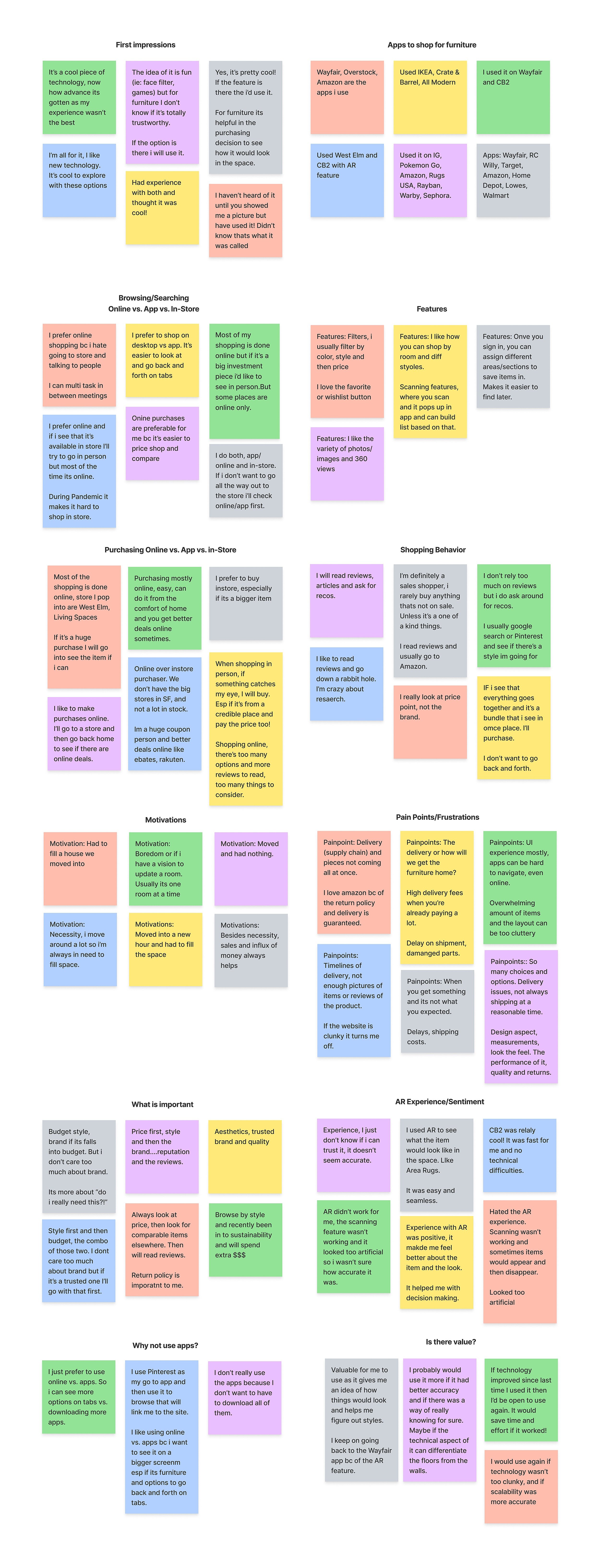
User Findings
57% of participants prefer to shop online vs. the 43% of participants prefer to purchase furniture at a store, in person

“I’m a huge coupon person and there’s better deals online like ebates, Rakuten, so I prefer to shop online”
“I prefer online shopping bc i hate going to store and talking to people. I can multi task in between meetings”


“Most of my purchases are done online. If it is a huge purchase I will go into a store to see the item if I can”
Identified frustrations and pain points
Issues with delivery
Poor user experience
Items not being what they expected
Lack of images & reviews
Overwhelming amount of items
66% of participants have had a positive AR experience when using the feature on a furniture shopping app, whereas 33% of participants had a negative experience

“I’m a huge coupon person and there’s better deals online like ebates, Rakuten, so I prefer to shop online”
“I used AR to see what the item would look like in the space. LIke Area Rugs. It was easy and seamless.”


“AR didn’t work for me, the scanning feature wasn’t working and it looked too artificial so i wasn’t sure how accurate it was”
User Persona
Through research and insights, I was able to form a persona, Joanne. She represents the target user and helped with the decision making process throughout this journey.
Define
Features to prioritize
To create the Feature Roadmap, I reflected back on the insights gathered from the user interviews in where I gathered insights from questions related to the users shopping behaviors. I was able to identify which features to prioritize having the users goals in mind.
Navigation of the App
Once I laid out what features to include in the app, I created this app map to provide a visual representation of the main features. The information architecture of the app is organized in a similar design pattern as its competitors so that users have familiarity of the navigation.
Establishing the Flow
By using the app map, I was able to identify the different tasks that I would want to execute in the usability testing. Based on these tasks, it would help me identify any potential issues that may arise as the users navigate the different scenarios.

Ideate
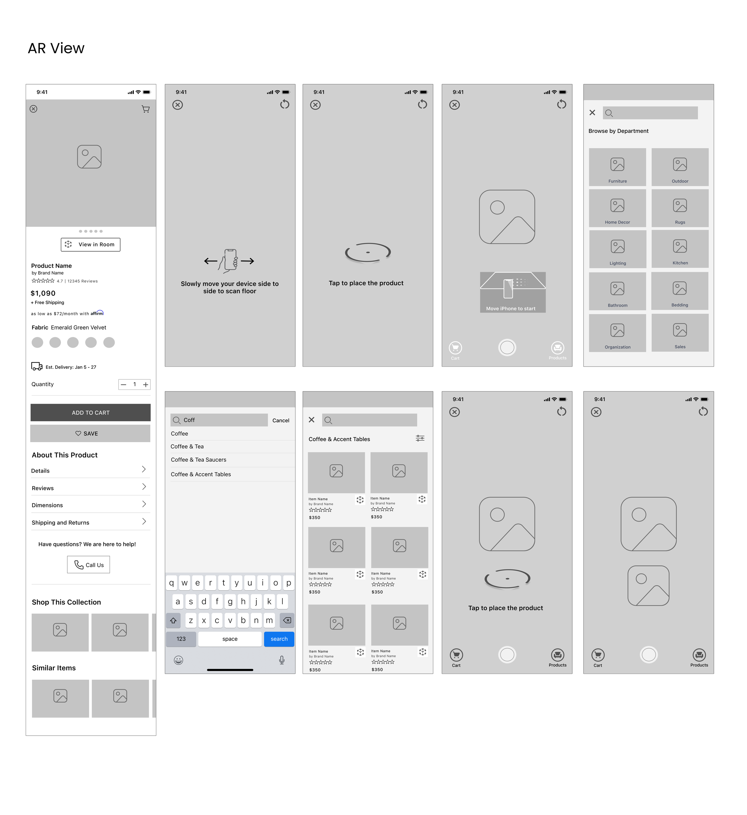
Wireframing
I created these low-mid fidelity wireframes based on some initial sketching and researching the different design patterns from the other furniture shopping apps. I wanted to capture the visual elements of what I wanted to include for each screen that would ultimately help me figure out what tasks I’d want to include when creating the prototype.

Branding
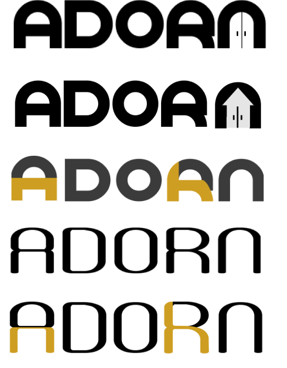
I knew that creating a brand from scratch was going to be challenging. I wanted to create a brand that would reflect a feeling of calmness, elegance, a modern, simplistic and inviting tone. I played around with different typography as I tend to lean that way to get inspiration for creating logos. I really liked the idea of having hidden imagery within the typography and found a typeface that resonated with the keywords and from there the logo (last one) was created.

Prototype & Test
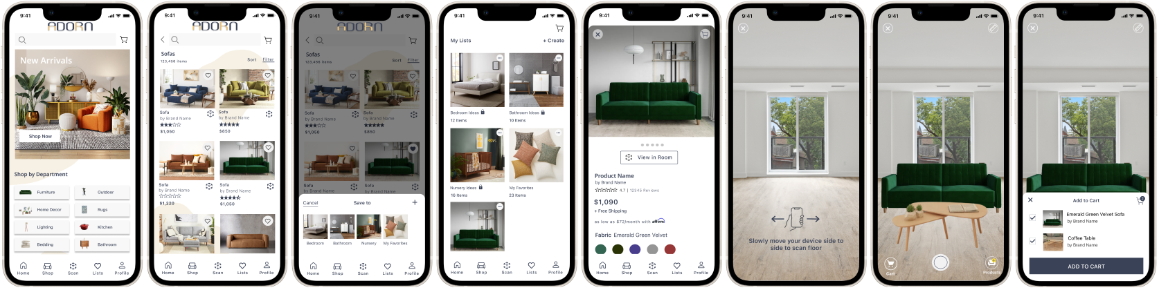
High Fidelity Prototype
I created the interactive prototype in Figma and linked the screens to demonstrate how the user would go about completing each task
Putting it to the test
The usability test was conducted with 4 participants who have all used or purchased furniture online before. The main objective was to observe how the user navigates the app to complete each task with ease. The test was to also identify any pain points or confusion in the process of interacting with the prototype.
Scenarios
Task #1: You just moved into a new house and you’re looking for some new furniture, specifically a Sofa to fit into the new space. Go ahead and browse the home screen and then go about navigating to where you would look for Sofas?
Task #2: You’re interested in the Sofa but not ready to purchase. Show me how you would Save and Create a New list from the Product Details screen.
Task #3: You’re not sure how the Sofa would fit or look in your space. How would you go about using the AR feature to look at it in your existing space?
Task #4: You want to add additional items, such as a coffee table? How would you go about adding another product to your AR view?
Task #5: You see what you like and want to add to your cart to make the purchase. How would you go about adding to cart and placing your order?
The results are in….
All tasks were successfully completed with little to no difficulty. I used an affinity map method to synthesize my findings and grouped them into different themes: Success, Confusions, Curiosity. Behaviors and Suggestions. As most of the feedback was positive, a majority of suggestions emerged from the AR view screens as it wasn’t as intuitive and caused some confusion.

Priority Revisions
Using the results from the affinity map, I took into consideration the suggestions that were brought to my attention. Here are the revisions I made to the homepage, product screens and AR view screens.

Reflection
Challenges can be scary and instead of shying away from it, I embraced it and took hold of it. The AR space was an interesting one to take hold of as I myself haven’t had that much experience with the technology and I was unsure of what insights would come out it or what wouldn’t come out of it. As a surprise, a majority of the participants have had positive experiences with AR, whereas the rest felt frustrations of it not working as intended or that they questioned the accuracy of it. Empathizing with the user was the biggest takeway from this project and to focus on the solution to provide a better user experience by utilizing the AR technology and its capabilities.