

Zeit
Responsive e-commerce website for time travel
Overview
Zeit’s is a conceptual time travel company that has opened up the gates that has made time travel available to all with its new and innovative technology. For over a decade, the technology was redacted due to safety concerns but with the assessments from philosophers, archeologists and high energy physicist were able to standardize and deliberate on approving time travel for Zeit.
The Challenge
Although this is an exciting time for Zeit, the company wants to ensure that the checkout process is seamless and users are able to navigate the website with ease.
The Solution
Create an intuitive responsive website that is user-centric and efficient that allows users to browse tours and experiences that they’d potentially like to book. Zeit’s brand messaging would also reflect a modern and fresh, yet classical and historical feel.
Role
UX Researcher
UI/UX Designer
Timeline
10 weeks
Tools
Figma
Whimsical
Optical Workshop
Define
Research
The main research goal here was to learn about the customer’s journey into how travels were booked and what was needed to guide them through their purchasing decision. During the research phase, I also wanted to understand a users motivation to travel, resources they use to research and book travel and what value they get out of traveling.
My research consisted of both competitor analysis, to better understand the travel/tourism industry and the offerings of the competitors and also user interviews. The user interviews gave me more qualitative insights that helped me determine key factors that lead a user to making their purchasing decision.
Competitor Analysis

User Interviews
I interviewed 4 participants that ranged between the ages of 31-39, 3 females and 1 male and all having experience booking travel through an online site. The user interviews were insightful as I was able to get more information out of the participants that helped me paint a better picture of what it is that motivates them to travel or what frustrations they have in the booking process or what criteria they look for when making that final decision.

“I just love to travel, visiting people, for personal events or work. I love going to new places!”

“I also really like the map views, especially with cities that I’m not familiar with. The map view is very helpful for me.”

“I like to feel somewhat enriched, have various life experiences that are different from my everyday life.”
Persona
Through the user research gathered, I created the user persona, Chloe. Chloe loves to explore new places and looks forward to experiencing different cultures and surrounding herself with enriching experiences. She likes having the flexbility of picking and choosing activities and doesn’t always have to stick to an agenda. She expects to find her next destination to be seamless and be able to navigate the website with ease.

Define
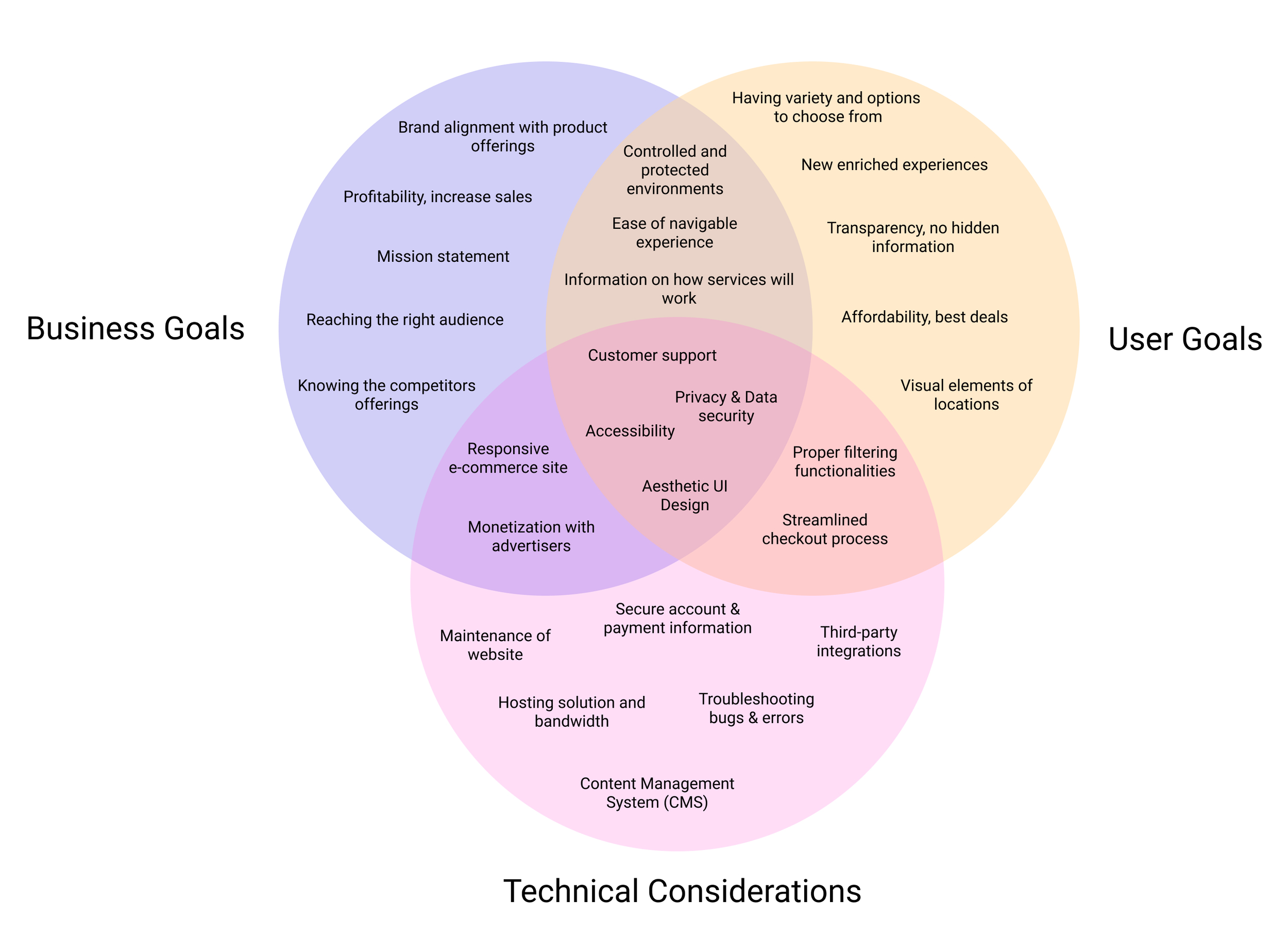
Project Goals
In creating the feature roadmap, I reflected on my research findings and outlined the business goals vs. user goals to ensure that I understand the reasoning behind the elements that have been prioritized.
Card Sorting
The card sorting research method was new to me but I knew that I would gain a better understanding of how the content should be organized based on how the users would group them in categories that would make the most sense.
Results
I used Optimal Workshop to conduct my card sort remotely and based on the results I had a sense of how people expected common and unique categories to be grouped. The card sort consisted of 20 cards with major events from different time periods and had 9 participants who completed the sort. From this practice, I was able to identify major categories such as North America, America History, Famous Works and Music & Arts.
Site Map
The results from the Feature Roadmap and Card Sorting allowed me to create the site structure to provide a visual of how I would organize the content of the site.
Ideate
Task Flow
I used the sitemap and our persona, Chloe to create the main task flow below that reflects how she would go about browsing the site for the experience of her choice and going through the steps to book her trip.

User Flow
The user flow explores the different possible ways Chloe would navigate through the website with decision points that would require her to perform a certain action in her decision making.

Wireframes
Reflecting on the sitemap, flows and feature roadmap, I crafted the product requirements that lead me to designing the low fidelity wireframes in Figma.

Branding
During the user interviews, all participants placed importance on visual elements that would inspire them in the decision making part of the process. I wanted to create a compelling interface that would focus on those elements and to help provide a vision of the old and the new that played into the futuristic feel.
I created a mood board where I was able to find inspiration for the color pallete and the imagery that I was going for that would bring the high fidelity wireframes to life. From here, I created the UI kit out of all the design elements to ensure that the styles were consistent throughout the entire interface.


Prototype & Test
High Fidelity Prototype
I created the prototype in Figma and consisted of high fidelity versions of the Homepage, Category page, Search Results page, Product page and booking page. My main goal was to test the usability of the Zeit experience from browsing, to searching to booking and to also identify any pain points along the way. Through in-person usability testing and remote testing where users shared their screen, I was able to assess their user experience based on the the main goals of the usability testing.

Usability Test
Overall, the usability testing was a success! All participants were able to complete each task and the design proved to be intuitive and the site was easy to navigate. I synthesized all the feedback and compiled it into this affinity map to find patterns of the successes, pain points and areas of improvement.

Priority Revisions
Based on users feedback, there were some areas of improvement that I made to the design, see below for the original and revised:
Added additional images within the hero section for users to view more images of the ‘Experience’
Updated ‘Activities’ to ‘What’s Included’ and added icons to clear up confusion on what this section entailed
Included image of map based on feed back to showcase where each ‘Experience’ is located

Reflection
As this was my very first user experience design project, I learned a lot about the design thinking process, from conducting user interviews, to wireframing, to prototyping and putting together my first case study that encapsulates this project.
The main takeaway and learning that I’ve had from this is to be more intentional in the user research process and lead with questions that will get you to the ‘why’, to understand the user and not go off of assumptions I’ve made.
Overall, it was an interesting experience to work on a fictional concept and go through the design techniques and put into practice what I know and learn along the way, even if it means a few fumbles